Who is in your group?
Danielle Ricketts (me), Carla Formosa, Mădălina Ciobanu, James Bartholomeou and Kaja-Marie Beiswanger
What are their roles?
Me – Research on elderly generation (secondary research), generating a questionnaire (primary research), searching for images for the visuals, creative concept and putting the presentation together.
Carla – Research young generation, creative concept, research on colours and visuals.
Madalina – worked on logo ideas, research on colours, creative concept and creating the visuals.
Kaja – creating social networking pages, creative concept and research on Age UK.
James – presenting logo ideas to the group, creative concept and why our pitch is the best.
Problem
We found the main problem to be how we were going to target the two opposite target audiences and attract them to each other. The platforms which we would target the young audience would be more likely online whereas the elderly audience would be more likely in print or TV. The differences between the audiences and creating a campaign for all of them was the main problem we found with the brief.
My research
Our solution: campaign ideas, platforms, media and duration
Campaign Ideas: Speed dating, cooking/computer workshops, shadowing the life of the opposite generation (life swap), a market on National Awareness Day. We aim to bring the audiences together by using everyday things which they have in common and how they can learn from each other.
Platforms: Billboards, bus stops, newspapers, leaflets/flyers, sponsored adverts on Facebook and Twitter.
Media: Print
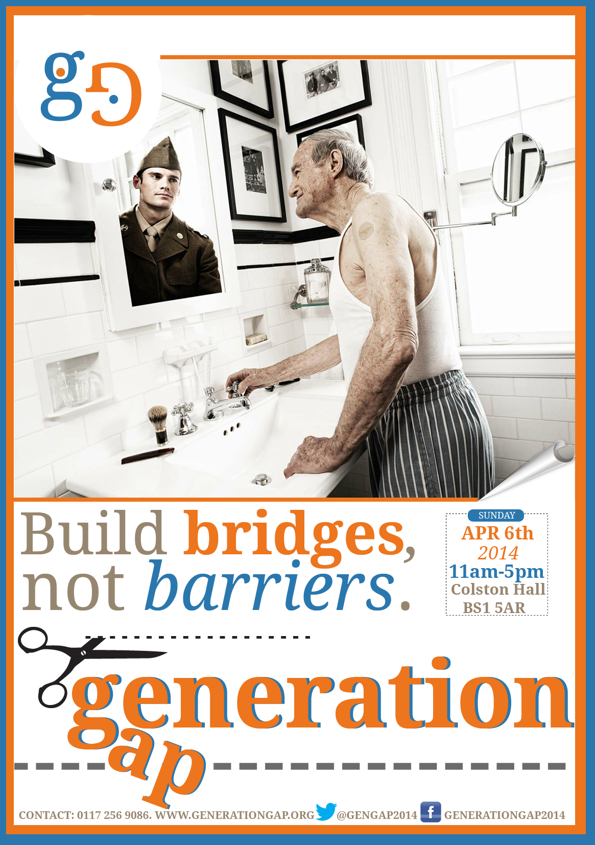
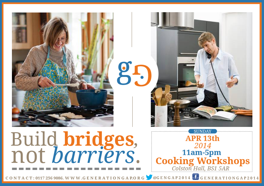
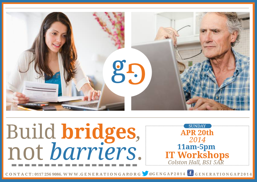
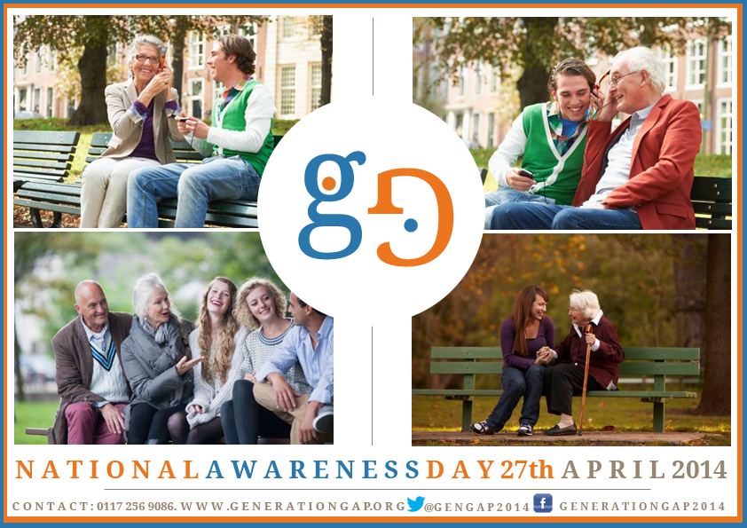
Duration: 1 month build up to the National Awareness Day throughout April 2014. Every Sunday of the Month. 6th – would be introducing the ages to each other e.g. a speed dating experience. 13th – cooking workshop for young people to learn from the older audience’s experience. 20th – I.T. workshop where the young audience can teach the elderly audience how to do things on computers. 27th – National Awareness Day – A market day where cooked goods and computer made items would be sold.
You can view our presentation to accompany our pitch here:
http://prezi.com/xeb3hjn3mxgd/?utm_campaign=share&utm_medium=copy&rc=ex0share
We decided to use a presentation to display our ideas visually as well as verbally. I put together the presentation with the key information needed as a journey through our campaign.
I used Getty Images to find possible images to match our visual ideas for our campaign.
Below you will find the images I found:
Cooking Images


Computer Images


Park Bench Images


Brief chosen: Awareness Raising Campaign: Enhancing cross-generational empathy
Name: GenGap
Campaign build up to the National Awareness day would include:
1. Life swap – young people accompanying elderly people on an afternoon in their lives and then vice versa. A way to get to know each other before workshops and the awareness day.
2. Cooking workshop ran by elderly people for young people.
3. IT (computer) workshop ran by young people for elderly people.
National Awareness Day will include:
Visuals:
Demographics:
Logo:
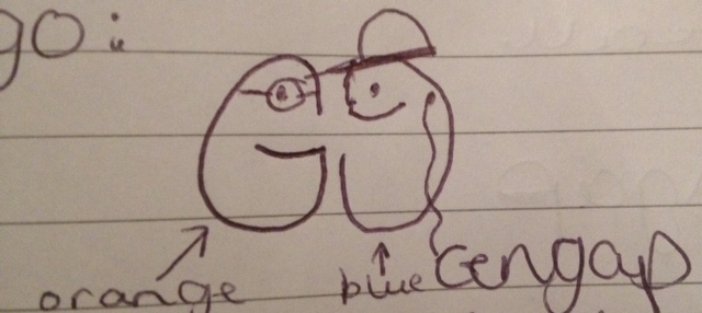
This is a drawing of our logo which shows two G’s linking; one representing the older generation (in orange) and one representing the younger audience (in blue). The younger person wears headphones which will swirl into the words ‘gen gap’.
Colour scheme:
Blue and Orange.
We explored the ‘Psychology of Colour’ at http://www.moosepeterson.com/techtips/color.html and discovered that:
Area of advertising I am investigating:
The historical change of media platforms used in advertising.
Research:
Possible information that may be useful:
Social media platforms – http://financepitch.com/how-social-media-platforms-are-changing-the-face-of-advertising/
Timeline of Advertising – http://adage.com/article/special-report-the-advertising-century/ad-age-advertising-century-timeline/143661/
Evolution of Advertising – http://www.slideshare.net/HubSpot/the-evolution-of-advertising-how-consumers-won-the-war-for-their-attention
Thesis: (the point of view you wish to develop, argue and explain)
“An exploration of the historical change of media platforms used in advertising throughout time and its affect on the advertising industry.”
Target Audience: Age 20-25
Google Chrome: Jamal Edwards SBTV
Agency: BBH
Demographics:
The advertisers in this campaign would have done a large amount of research to find out about their target audience. As Google is a huge organisation they would have most likely done insight marketing and they can track their audience’s internet usage.
Critical thinking: This advertisement markets the internet in a unique way, it advertises it as a platform for you to achieve your dreams, rather than an internet for personal entertainment. It’s a revolutionary idea for an advertisement for the internet.
Content strategy: They have decided to include the main and exciting parts of Jamal’s career rather than including the boring parts. They have included the exciting filming opportunities but left out the research and organising he must of had to do to get there. There is a theme as Google made a series of these advertisements, not necessarily aimed at the same audience, e.g. The Satchel Company advertisement is based on a mother who starts her own business using Google Chrome. You could recognise the brand from any of these sets of advertisements.
Editorial tone: The tone used in the advertisement is aimed at the young audience, the typing uses slang and very colloquial language.
Hierarchy of information: There is a chronological story to this advertisement and it builds up pace and gets more exciting throughout. They have decided to use the most exciting parts of Jamal’s career to build a picture of the stages he has gone through to get where he is today. They begin with the Google Chrome icon and the name of the entrepreneur featured because it is important information and what the audience needs to know for the rest of the advertisement to make sense.
Powerful and persuasive ‘call to action’: The advertisement is very clear in what it wants the audience to do. They want the audience to use Google Chrome.
Imagery: The imagery used is very creative as it has a layout like a computer screen, although it is a video. It uses pictures, videos (video showing video) and typing effects inside the advertisement.
Best media to spread your message: They picked television as their main platform for this advertisement as it reaches a large audience. They also put the advert on Youtube which proved very successful as it now has over 6 million views. YouTube was a great idea for the audiences age as they are the prime users of the internet and websites like YouTube.
Target Audience: Age 30-35
http://www.youtube.com/watch?v=ftkYPpD4K8M
Department of Health (NHS) – Smokefree Generation

Agency: Miles Calcraft Briginshaw Duffy (MCBD)
Platform: Television, Radio, Print, Outdoor, PR/Press and Digital.
Demographics:
To get to know their target audience they may have used focus groups to get to know their audience. They may have possibly used groups from NHS stop-smoking sessions to find out what made them want to give up smoking. They most likely would have used insight marketing too.
Critical thinking: The thought behind these advertisements is very clever due to the fact that they use real children of smokers to come and speak to the camera with their own personalised message. The idea is not highly creative but it is simple and powerful. They go beyond social norms where actors are usually used and attempt to reach their audience directly by making them think of their children.
Content strategy: The advertisers behind the campaign have decided to use emotional material and have most likely edited out anything that would not target the audience emotionally. There is a theme between the adverts and all their platforms, they follow the same conventions so they are recognisable as coming from the same campaign. They reveal the message quickly to take a direct approach.
Editorial tone: The editorial tone in the advertisements, across all platforms, is as if a child is speaking to their parent and then a serious instructive message to inform the audience of how to quit smoking. The advertisers use a instructive tone as it is more likely to be effective as it takes a direct approach and doesn’t ‘beat around the bush’.
Hierarchy of information: The information in the advertisements are displayed so the child’s message reaches the audience first and is followed by the logo and information to quit. This is to get the attention of the audience and make them think about their family before they are told what they can do. The information from the children is shouted as that is how they want the audience to quit smoking and the message from the NHS appears smaller as it is likely to be more effective coming from young children rather than a large, health organisation.
Powerful and persuasive call to action: The advertisements make it clear that they want you to stop smoking and give you the information to stop by trying to get you to pick up a stop smoking kit or to call a helpline. The campaign message is very clear to the audience.
Imagery: The imagery used in the advertisements appear simple but have been carefully constructed so the audience only focuses on the child and they use close up shots to show the children’s emotion which aims to touch the viewer’s feelings.
Best media to spread your message: These NHS advertisements use a number of platforms to target their audience everywhere. For example: when they are at home watching television, when they are in their car on billboards and the radio, when they are online on their computer and when they are reading the newspaper. This is very effective in reminding the audience of the message wherever they turn. Using this many platforms achieved them reaching “90% of the target audience were aware of the campaign” (according to smokefree.nhs.uk website).
You can view the series of television advertisements here: http://www.campaignlive.co.uk/thework/938082/Department-Health-real-kids-Miles-Calcraft-Briginshaw-Duffy/?DCMP=ILC-SEARCH
Target Audience: Age 60-65
http://www.tellyads.com/show_movie.php?filename=TA5634
Fixodent – Apple Bobbing
Demographics:
To find out information about their target audience they would have most likely used a focus group in the case of this audience. The audience is harder to reach online so therefore would have been more likely to be reached by actually speaking to the audience. Census data may have also been used.
Critical thinking: The advertisement may not be an extremely creative advertisement but it is very well thought out for the audience, targeting them by the use of family and love to allow them to relate to their own life.
Content strategy: They decided that the content should include a family event with an elderly couple at the centre of it. The characters are relatable to the audience. They do not reveal the product until near the end so they audience are intrigued to find out how the dentures look so realistic. The last shot shows the couple with what appears to be their grandchildren, to show they understand their audience.
Editorial tone: The editorial tone that this advertisement uses is professional, well-written language but it is simple and easy to follow. The music used is traditional to fit with the target audience.
Hierarchy of information: The important information is shown at the end of the advertisement because it aims to interest the audience into finding out what is being advertised. They begin by setting up the scene of the advertisement showing an apple and then going on to show perfect smiles. They decided to put the important words in bold to highlight what the advertisement is about.
Powerful and persuasive ‘call to action’: The advertisers make it clear that they want the target audience to buy the Fixodent product. They aim to be powerful persuaders by focusing on things that their audience will be able to relate to, e.g. their grandchildren.
Imagery: The imagery used in the television advertisement is simply filmed and not too flashy. The audience are more likely to relate to something simply filmed accompanied with basic on-screen-graphics.
Best media to spread your message: They use a television platform to reach their audience which is a wise platform to choose for the elderly audience. An internet or social media platform may not be appropriate as you would only reach a tiny amount of the targeted audience. The advertisement showed above is the short television version of the advert but there was also a longer version of the advertisement. Using the two lengths of adverts can be effective because if you play the long advert to begin with and then progress on to the shorter advertisement, you are reminding the audience of the product that they have already seen advertised.
The media portray an extremely unrealistic representation of not only women, but men too. We could think of tons of advertisements that objectify, airbrush and portray a false reality of women. However, people forget that men are always edited and shown to be unlike the average man. Advertisements can make people feel very inadequate. The average female is size 16, 11 stone and 5’3 and the average male is 5’9 and 13 stone. These averages are very different than what is represented in the majority of advertisements.
Examples
Paco Rabanne – ‘Invictus’ by Alexandre Courtès
This advertisement is shocking in every way. The male is represented to have the ultimate powerful, to be the best and the females become the man’s objects. They are dressed in white to symbolise innocence connoting virginity and the advert implies the man is going to take control of them. The male is clearly edited and has perfect skin, an extremely muscular body and attractive face; the sort of representation which will make almost all men feel vulnerable about themselves.
Lynx – ‘Billions’ by Swan Media
Lynx play on a very similar idea to the Paco Rabanne advertisement above; their product will attract women and make you powerful. However, the man has not got a six pack but is not unattractive and has most likely still been edited. The representation is meant to represent a more ordinary man to attract the audience to be interested in the product. The females in the advertisement are extremely thin and beautiful which is enough to make any woman feel inadequate.
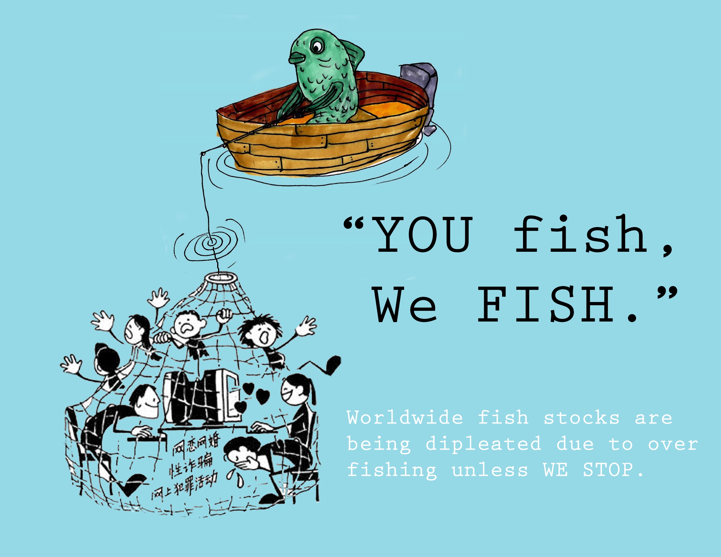
This advertisement was made in class this week to attempt to save the cod. This was a quick pair task and we came up with the idea of switching the roles so fish are fishing humans. We wanted the audience to think would they like being fished into a net? This was a brief, quick campaign idea which could be taken further.
“It refers to the practice of making spoofs or parodies of corporate and political advertisements. Subvertisements may take the form of a new image or an alteration to an existing image or icon, often in a satirical manner.” – http://en.wikipedia.org/wiki/Subvertising
Subversive advertising is rarely the advertisements you encounter day to day but there are tons of adverts which take a twist of an original and give it the opposite meaning. They tend to be extreme and make people think about what is actually being advertised at them.
Adbusters is an activist group who focus on spreading their message of anti-consumerism and pro-environment. They have a magazine, organise their own campaign and feature spoof ads.
Guerilla Girls are “feminist masked avengers” who “expose sexism, racism and corruption in politics, art, film and pop culture with facts, humour and outrageous visuals.” (http://www.guerrillagirls.com/index.shtml)
Examples:
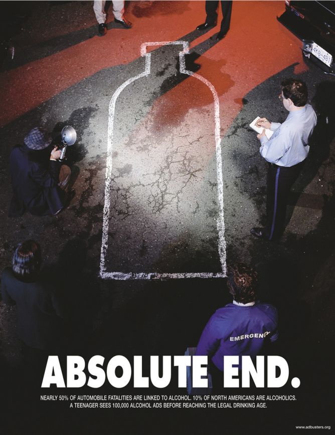
From www.adbsuters.org
This adbuster carries a strong message of what alcohol adverts are persuading audiences to buy. Instead of attracting the audience it aims to repulse them.
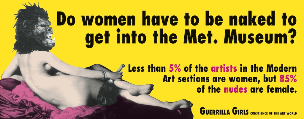
From http://www.guerrillagirls.com
This Guerrilla Girls campaign is to make people realise how little of the art in museum’s is made by women but features naked females. The message is direct and attention-grabbing to get the message straight across.

From https://www.adbusters.org/campaigns/bnd
Buy Nothing Christmas and Buy Nothing Day are campaigns ran by Adbusters to protest against consumerism. They try to not only get people to change their buying habits for a day but forever.
