Brief chosen: Awareness Raising Campaign: Enhancing cross-generational empathy
Name: GenGap
- Standing for generation gap but the generation is abbreviated because it shows us closing the gap between the words like we plan to bring the generations closer together. In addition “Gen” sounds more modern for our younger audience.
Campaign build up to the National Awareness day would include:
1. Life swap – young people accompanying elderly people on an afternoon in their lives and then vice versa. A way to get to know each other before workshops and the awareness day.
2. Cooking workshop ran by elderly people for young people.
3. IT (computer) workshop ran by young people for elderly people.
National Awareness Day will include:
- Markets ran across main cities in the UK for young people to show off and sell the food they have learnt to cook and for the elderly people to show off and sell the things they have made on the computer, for example Easter cards, bookmarks, calenders etc.
- Money raised from the markets goes to Age UK.
Visuals:
- An elderly person looking into a mirror and seeing a younger self.
- Split-screen with the two generations cooking and being on a computer. The cooking visual will show a young person struggling and an elderly person succeeding. The computer visual will show an elderly person struggling and a young person succeeding.
- Unity between the generations on a park bench – smiling young and elderly person sat together.
Demographics:
- 18-25
- 60-75
Logo:
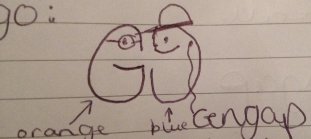
This is a drawing of our logo which shows two G’s linking; one representing the older generation (in orange) and one representing the younger audience (in blue). The younger person wears headphones which will swirl into the words ‘gen gap’.
Colour scheme:
Blue and Orange.
We explored the ‘Psychology of Colour’ at http://www.moosepeterson.com/techtips/color.html and discovered that:
- Blue – “is the second most powerful colour. It obviously represents coolness, mist and shadows. In some applications it can represent peacefulness and calmness. Blue is a contemplative color, meaning intelligence and strength. It is one of the most politically correct colours there is with no negative connotations of it anywhere on the globe.”
- Orange – “is a good balance between the passionate red and the “yellow of wisdom.” Orange is symbolic of endurance, strength and ambition. Orange is said to also have the cheerful effect of yellow, but is intensified in its closeness to the colour red.”
